
I have once again been inspired by a tweet! This one came from @WeAreRLadies, which was being moderated by Alison Hill at the time.
Alison was at RStudio headquarters in Boston, when she noticed a ggplot2 themed clock! To which I had a totally normal reaction.

I decided that I must have one. So I set about trying to recreate the ggclock.
Create the data
First things first. If we are going to create a plot, we need some data. Specifically, we need a point a for every minute, and then larger points for each hour. We create a point for every minute, 0 through 60, and we can mark the hours by selecting the 5 minute marks. I’ve set y to be 1, as this will end up being the radius of our circle.
library(tidyverse)

minutes <- data_frame(x = 0:60, y = 1)
minutes
#> # A tibble: 61 × 2
#>        x     y
#>    <int> <dbl>
#>  1     0     1
#>  2     1     1
#>  3     2     1
#>  4     3     1
#>  5     4     1
#>  6     5     1
#>  7     6     1
#>  8     7     1
#>  9     8     1
#> 10     9     1
#> # … with 51 more rows

hours <- filter(minutes, x %% 5 == 0)
hours
#> # A tibble: 13 × 2
#>        x     y
#>    <int> <dbl>
#>  1     0     1
#>  2     5     1
#>  3    10     1
#>  4    15     1
#>  5    20     1
#>  6    25     1
#>  7    30     1
#>  8    35     1
#>  9    40     1
#> 10    45     1
#> 11    50     1
#> 12    55     1
#> 13    60     1
Now that we have data, we can start making the plot!
Making the ggclock
We start by plotting each of the point (minutes and hours). Consistent with the original ggclock, we will make the hour markers slightly larger and colored, with the colors starting at 12 o’clock (the 60 minute mark).
ggplot() +
  geom_point(data = minutes, aes(x = x, y = y)) +
  geom_point(data = hours, aes(x = x, y = y,
                               color = factor(x, levels = c(60, seq(5, 55, 5)))),
             size = 4, show.legend = FALSE)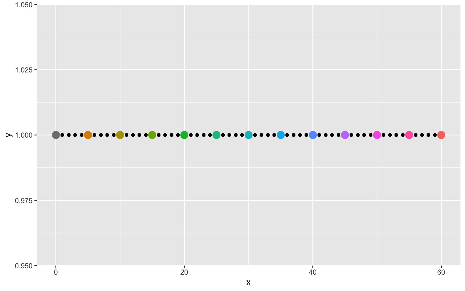
The next step is to put these points into a cirle. This can be done with coord_polar.
ggplot() +
  geom_point(data = minutes, aes(x = x, y = y)) +
  geom_point(data = hours, aes(x = x, y = y,
                               color = factor(x, levels = c(60, seq(5, 55, 5)))),
             size = 4, show.legend = FALSE) +
  coord_polar()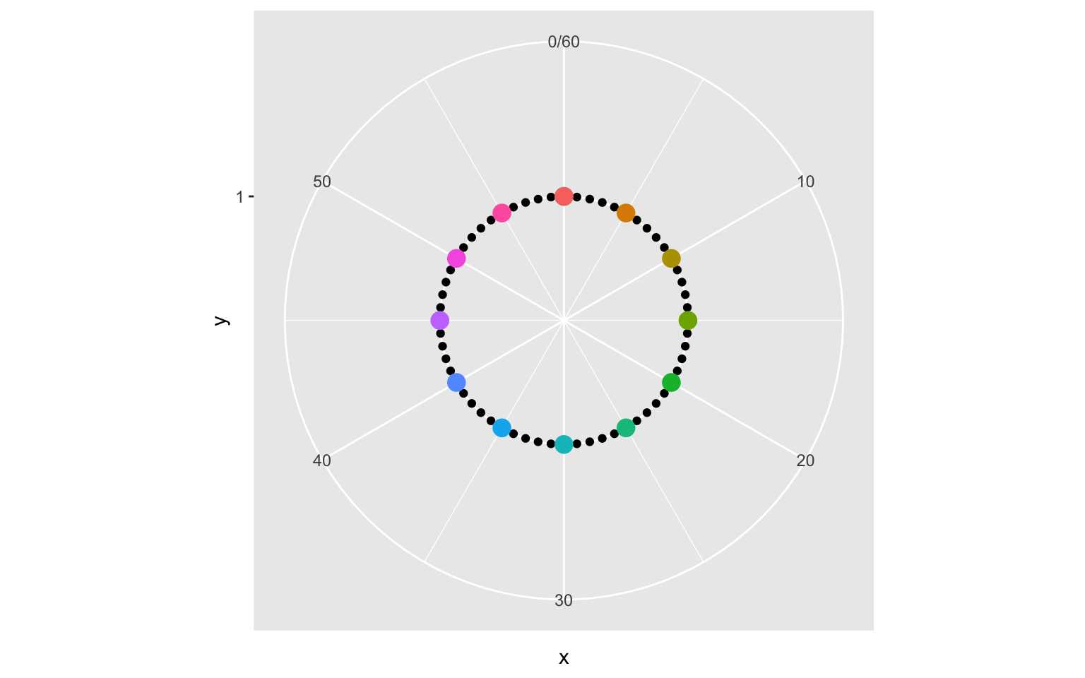
Now it’s starting to look more like a clock! In order to not waste any space, we can expand the limits of the y-axis.
ggplot() +
  geom_point(data = minutes, aes(x = x, y = y)) +
  geom_point(data = hours, aes(x = x, y = y,
                               color = factor(x, levels = c(60, seq(5, 55, 5)))),
             size = 5, show.legend = FALSE) +
  coord_polar() +
  expand_limits(y = c(0, 1))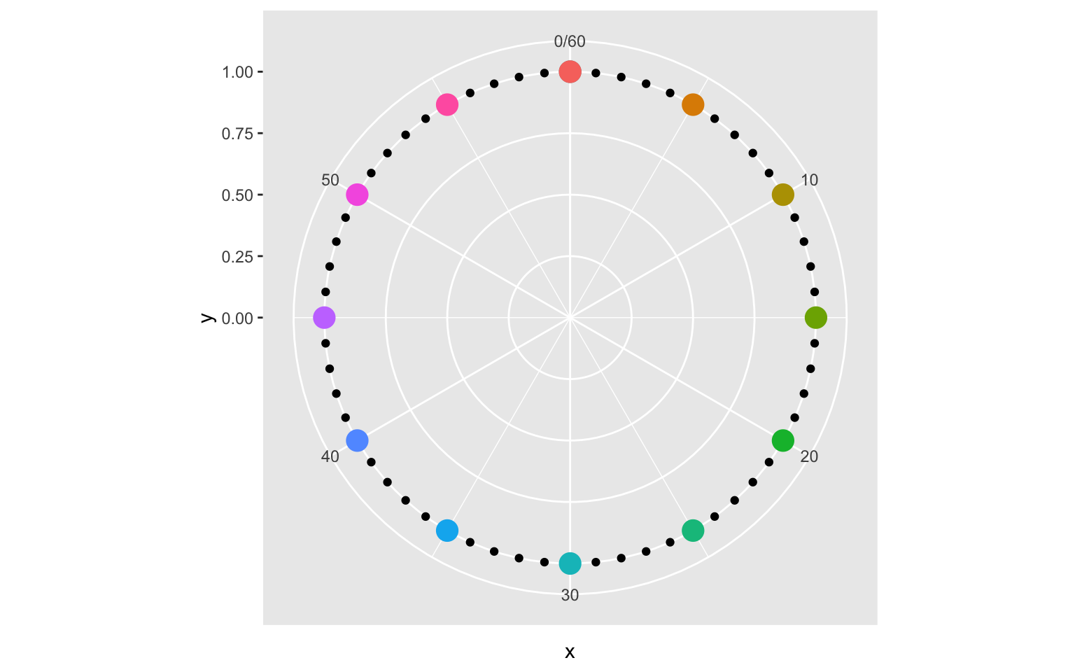
Next, we can set the breaks of the x-axis to show the necessary hour marks. We can also set the breaks of the y-axis, which control the circles on the interior of the clock.
ggplot() +
  geom_point(data = minutes, aes(x = x, y = y)) +
  geom_point(data = hours, aes(x = x, y = y,
                               color = factor(x, levels = c(60, seq(5, 55, 5)))),
             size = 5, show.legend = FALSE) +
  coord_polar() +
  expand_limits(y = c(0, 1)) +
  scale_x_continuous(breaks = seq(15, 60, 15), labels = c(3, 6, 9, "0/12")) +
  scale_y_continuous(breaks = seq(0, 1, 0.25))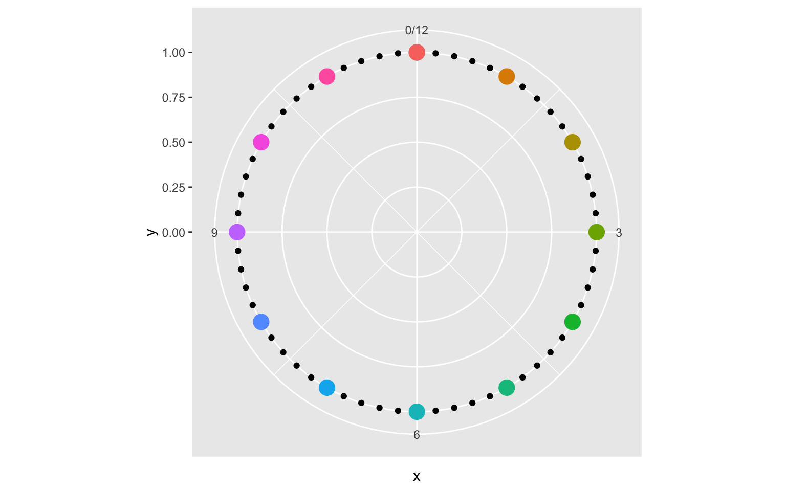
So close! Now we just need some formatting. First we specify that we are using theme_grey, and scaling the colors using scale_color_discrete. This is not strictly necessary, as these are the default, but being explict will allow us to easily change these options later on. We then modify the theme using the theme function. We need to remove axis titles and ticks, and labels on the y-axis. This can be done with element_blank. For the x-axis labels (our hour markers) we increase the font size using element_text. Finally, we can make the grid lines more distinct by increase the size of the panel grid using element_line.
ggplot() +
  geom_point(data = minutes, aes(x = x, y = y)) +
  geom_point(data = hours, aes(x = x, y = y,
                               color = factor(x, levels = c(60, seq(5, 55, 5)))),
             size = 5, show.legend = FALSE) +
  coord_polar() +
  expand_limits(y = c(0, 1)) +
  scale_x_continuous(breaks = seq(15, 60, 15), labels = c(3, 6, 9, "0/12")) +
  scale_y_continuous(breaks = seq(0, 1, 0.25)) +
  scale_color_discrete() +
  theme_grey() +
  theme(
    axis.title = element_blank(),
    axis.ticks = element_blank(),
    axis.text.x = element_text(size = 20),
    axis.text.y = element_blank(),
    panel.grid.major = element_line(size = 2),
    panel.grid.minor = element_line(size = 2)
  )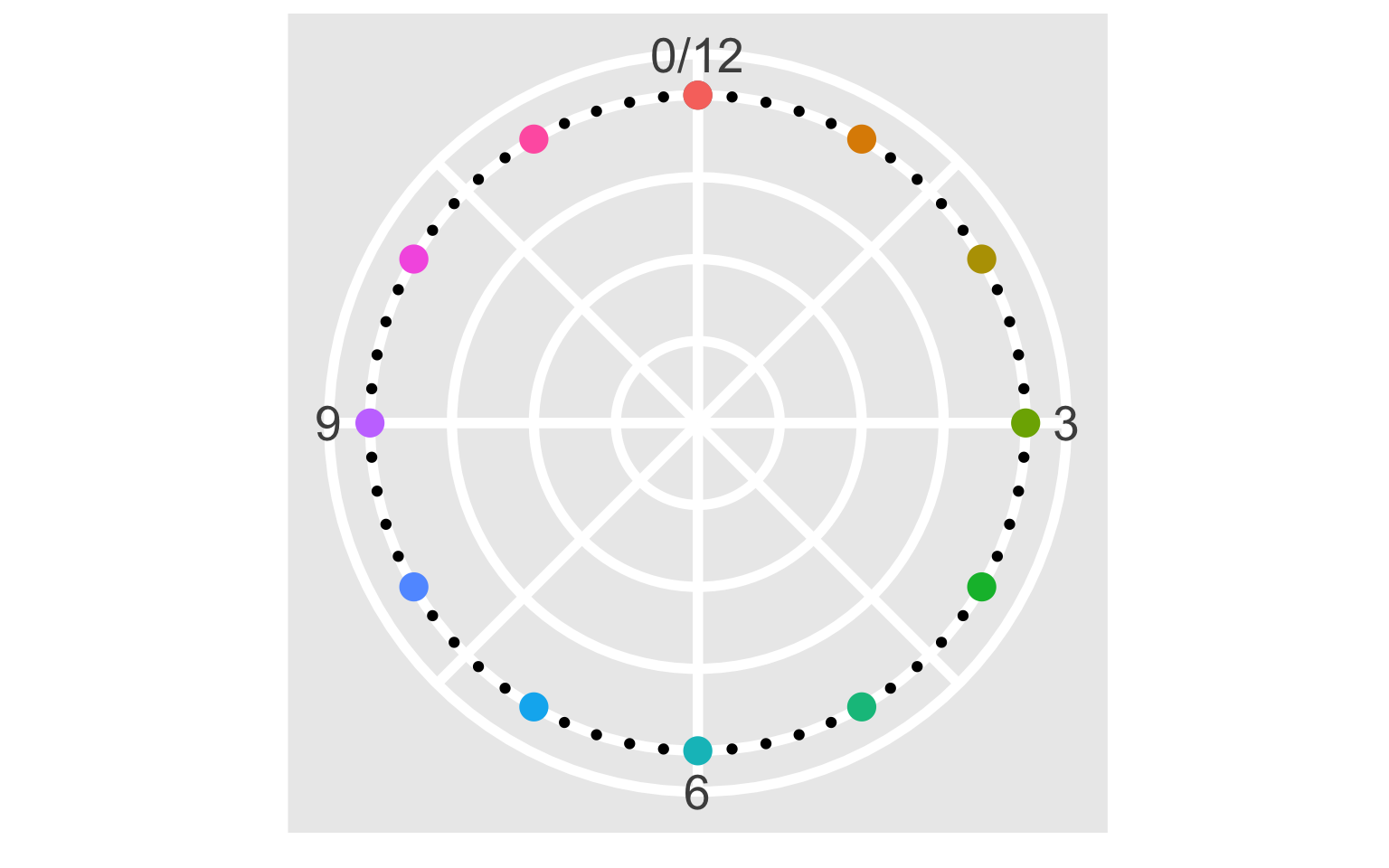
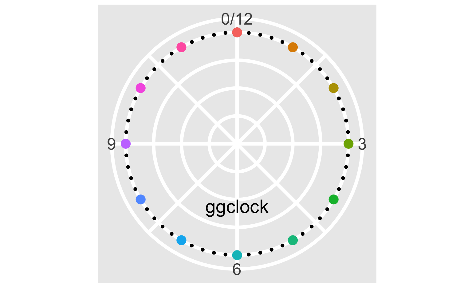
And now we have our clock face! There are just a couple of details remaining to fully replicate the original: the “ggclock” text, and the RStudio ball. The text can be added using geom_text.
ggplot() +
  geom_point(data = minutes, aes(x = x, y = y)) +
  geom_point(data = hours, aes(x = x, y = y,
                               color = factor(x, levels = c(60, seq(5, 55, 5)))),
             size = 5, show.legend = FALSE) +
  geom_text(aes(x = 30, y = 0.5, label = "ggclock"), vjust = 1, size = 8) +
  coord_polar() +
  expand_limits(y = c(0, 1)) +
  scale_x_continuous(breaks = seq(15, 60, 15), labels = c(3, 6, 9, "0/12")) +
  scale_y_continuous(breaks = seq(0, 1, 0.25)) +
  scale_color_discrete() +
  theme_grey() +
  theme(
    axis.title = element_blank(),
    axis.ticks = element_blank(),
    axis.text.x = element_text(size = 20),
    axis.text.y = element_blank(),
    panel.grid.major = element_line(size = 2),
    panel.grid.minor = element_line(size = 2)
  )
Finally, the RStudio ball can be added using geom_image from Guangchuang Yu’s ggimage package.
library(ggimage)
logo <- "https://www.rstudio.com/wp-content/uploads/2014/06/RStudio-Ball.png"

ggplot() +
  geom_point(data = minutes, aes(x = x, y = y)) +
  geom_point(data = hours, aes(x = x, y = y,
                               color = factor(x, levels = c(60, seq(5, 55, 5)))),
             size = 5, show.legend = FALSE) +
  geom_text(aes(x = 30, y = 0.5, label = "ggclock"), vjust = 1, size = 8) +
  geom_image(aes(x = 60, y = 0.75, image = logo), size = 0.08) +
  coord_polar() +
  expand_limits(y = c(0, 1)) +
  scale_x_continuous(breaks = seq(15, 60, 15), labels = c(3, 6, 9, "0/12")) +
  scale_y_continuous(breaks = seq(0, 1, 0.25)) +
  scale_color_discrete() +
  theme_grey() +
  theme(
    axis.title = element_blank(),
    axis.ticks = element_blank(),
    axis.text.x = element_text(size = 20),
    axis.text.y = element_blank(),
    panel.grid.major = element_line(size = 2),
    panel.grid.minor = element_line(size = 2)
  )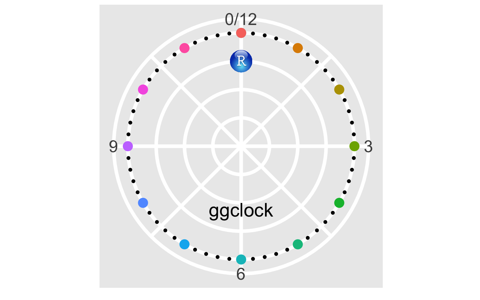
And there we have it! Our very own ggclock!
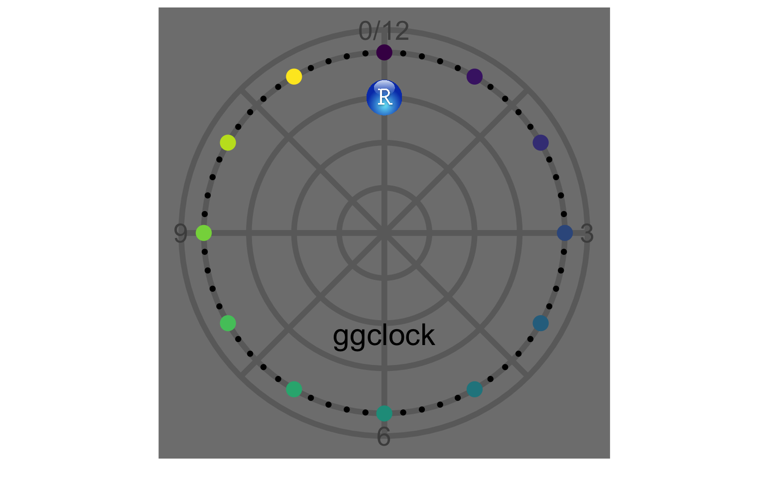
Changing the theme
As I mentioned earlier, we can also change the theme to give the ggclock a different look. For example, here is the clock with theme_dark and scale_color_viridis_d.
ggplot() +
  geom_point(data = minutes, aes(x = x, y = y)) +
  geom_point(data = hours, aes(x = x, y = y,
                               color = factor(x, levels = c(60, seq(5, 55, 5)))),
             size = 5, show.legend = FALSE) +
  geom_text(aes(x = 30, y = 0.5, label = "ggclock"), vjust = 1, size = 8) +
  geom_image(aes(x = 60, y = 0.75, image = logo), size = 0.08) +
  coord_polar() +
  expand_limits(y = c(0, 1)) +
  scale_x_continuous(breaks = seq(15, 60, 15), labels = c(3, 6, 9, "0/12")) +
  scale_y_continuous(breaks = seq(0, 1, 0.25)) +
  scale_color_viridis_d() +
  theme_dark() +
  theme(
    axis.title = element_blank(),
    axis.ticks = element_blank(),
    axis.text.x = element_text(size = 20),
    axis.text.y = element_blank(),
    panel.grid.major = element_line(size = 2),
    panel.grid.minor = element_line(size = 2)
  )
Conclusion
If you are interested in just the code to generate the ggclock, it can be found in this gist. If you actually want to get the ggclock made, you can order a custom clock here. I’ve also included larger, high resolution ggclock images in the comments of the gist that are suitable for printing. If you do actually get a ggclock made, tweet a picture at me (@wjakethompson)! I’d love to see more out in the wild!
Acknowledgments
Featured photo by Moritz Kindler on Unsplash.