
If you haven’t seen it yet, there’s a great example of why it’s always important to visualize your data making its way around the Twitter-verse.
Despite looking very different, all of these datasets have the same summary statistics to two decimal places. You can download the datasets, get details about the project, and read the whole paper by Justin Matejka and George Fitzmaurice here. In this post, I’ll show how we can recreate the GIF from the above tweet using tweenr and gganimate.
Creating the plots
The first step is to read in the data. The data has three variables: the dataset name, x, and y. I’ll define dataset as a factor so that the datasets will appear in the correct order in the animation.
library(tidyverse)
library(forcats)

datasaurus <- read_table2("data/DatasaurusDozen.tsv",
  col_names = TRUE, col_types = "cnn") %>%
  mutate(dataset = as_factor(dataset))
datasaurus
#> # A tibble: 1,846 × 3
#>    dataset     x     y
#>    <fct>   <dbl> <dbl>
#>  1 dino     55.4  97.2
#>  2 dino     51.5  96.0
#>  3 dino     46.2  94.5
#>  4 dino     42.8  91.4
#>  5 dino     40.8  88.3
#>  6 dino     38.7  84.9
#>  7 dino     35.6  79.9
#>  8 dino     33.1  77.6
#>  9 dino     29.0  74.5
#> 10 dino     26.2  71.4
#> # … with 1,836 more rows
We can view all of the datasets at once using facet_wrap in ggplot2.
ggplot(datasaurus, aes(x = x, y = y)) +
  facet_wrap(~ dataset, nrow = 3) +
  geom_point()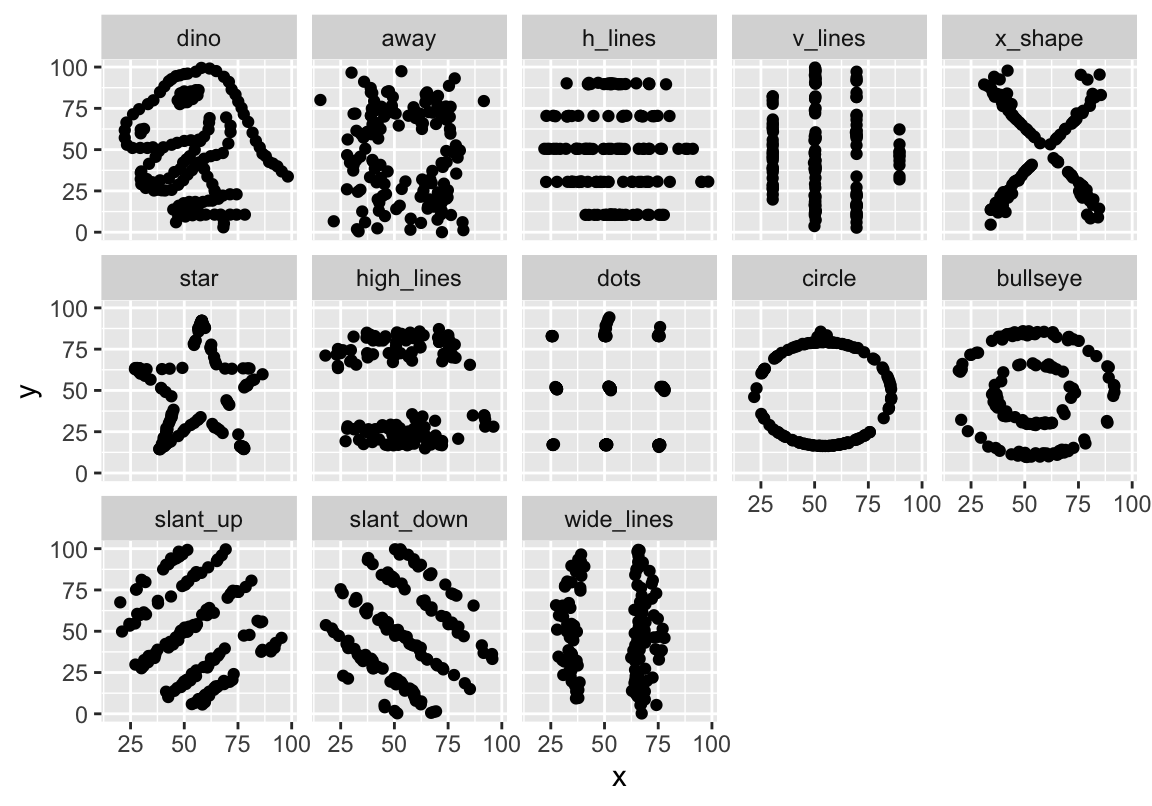
Hard to believe all of these datasets have the same summary statistics!
Animating the plots
For a first pass at animating these datasets, I’ll use the gganimate package. This works just like ggplot code above, just with an added frame aesthetic and no facet_wrap.
library(gganimate)

p <- ggplot(datasaurus, aes(x = x, y = y)) +
  geom_point(aes(frame = dataset))

animation::ani.options(interval = 1)
gganimate(p, title_frame = FALSE)
This is close, but not quite what I was looking for. This does indeed animate all of the datasets, but in order to duplicate the GIF above, I really want to see the points moving into their new positions for each dataset. To get this effect, I’ll use the tweenr package. tweenr takes in a list of dataframes, and then interpolates the transitions between the states.
First, I’ll create a list of the datasets.
n_datasaurus <- datasaurus %>%
  group_by(dataset) %>%
  nest() %>%
  ungroup() %>%
  add_row(dataset = "dino", data = list(.$data[[1]]))
n_datasaurus
#> # A tibble: 14 × 2
#>    dataset    data
#>    <chr>      <list>
#>  1 dino       <tibble [142 × 2]>
#>  2 away       <tibble [142 × 2]>
#>  3 h_lines    <tibble [142 × 2]>
#>  4 v_lines    <tibble [142 × 2]>
#>  5 x_shape    <tibble [142 × 2]>
#>  6 star       <tibble [142 × 2]>
#>  7 high_lines <tibble [142 × 2]>
#>  8 dots       <tibble [142 × 2]>
#>  9 circle     <tibble [142 × 2]>
#> 10 bullseye   <tibble [142 × 2]>
#> 11 slant_up   <tibble [142 × 2]>
#> 12 slant_down <tibble [142 × 2]>
#> 13 wide_lines <tibble [142 × 2]>
#> 14 dino       <tibble [142 × 2]>
I’ve also added the dino dataset again at the bottom so that the GIF with start and end with that dataset, making it seamless. I’ll then use tween_states, sending it the list of dataframes, and specifying the length of each state and transitions (I had to play around a bit with the numbers until I was happy with the final animation).
tween_datasaurus <- tween_states(n_datasaurus$data, tweenlength = 1,
  statelength = 0.5, ease = "sine-out", nframe = 200) %>%
  as.tibble()
tween_datasaurus
#> # A tibble: 28,400 x 5
#>        x     y .phase   .id .frame
#>    <dbl> <dbl> <chr>  <int>  <int>
#>  1  55.4  97.2 static     1      1
#>  2  51.5  96.0 static     1      1
#>  3  46.2  94.5 static     1      1
#>  4  42.8  91.4 static     1      1
#>  5  40.8  88.3 static     1      1
#>  6  38.7  84.9 static     1      1
#>  7  35.6  79.9 static     1      1
#>  8  33.1  77.6 static     1      1
#>  9  29.0  74.5 static     1      1
#> 10  26.2  71.4 static     1      1
#> # … with 28,390 more rows
This creates a new dataframe with the added .frame variable. I can then use the same gganimate code from above, just specifying .frame as the frame aesthetic instead of dataset.
p <- ggplot(tween_datasaurus, aes(x = x, y = y)) +
  geom_point(aes(frame = .frame))

animation::ani.options(interval = 1 / 15)
gganimate(p, title_frame = FALSE)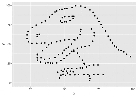
And there you have it! Now we can see all of the points moving between each dataset!
Acknowledgments
Featured photo by Nate DeWaele on Unsplash.