Disclaimer: I originally wrote and planned to release this post on January 6, 2021, to celebrate Congress officially certifying Joe Biden’s win. But then there was an insurrection, and it didn’t really feel appropriate. So instead I’m releasing the one year anniversary of the race being called by the AP.

To celebrate, I thought I’d look back at the many election forecasts we had in 2020 to see which forecast performed the best, given the final results. To do this, we’ll look at two outcomes: prediction accuracy and model accuracy. But first, the data!
The Forecasts
There were so. many. forecasts. I tried my best to gather as many as I could prior to election day. Ultimately, here are the forecasts I was able to pull probabilities of each candidate winning from for each state.
- Decision Desk HQ
- Drord Mapmaking
- Economist
- Electoral Polls
- FiveThirtyEight
- JHK Forecasts
- Lean Tossup
- New Statesman
- Plural Vote
- PredictIt
- Princeton Election Consortium
- Progress Campaign
- Race to the White House
- Reed Forecasts
- The Cycle
I also pulled the 2016 map to use as a baseline measure. All of the data is available in a Google sheet here. In the Google sheet, the probabilities indicate the probability that Joe Biden would win each state.
A few of the forecasts (including notably, the Economist) did not forecast the congressional districts in Nebraska and Maine separately from the whole state. Thus, for those forecasts, I used the statewide probability for each of the individual congressional districts as well, as that was the probability those forecasts assigned to each candidate for winning all electoral college votes from the state.
Prediction Accuracy
We’re defining prediction accuracy as how close the estimated probabilities were to the observed outcome. We can assess this through three measures: log-loss, Brier Score, and a weighted Brier Score. All of these measures evaluate how close the probability was to the observed event. The log-loss is very common classification metric and is defined as
\[ \text{Log-Loss}=-\frac{1}{P}\sum_{i=1}^Py_i\log(\hat{y}_i) + (1 - y_i)\log(1-\hat{y}_i) \]
In this equation, P is the total number of predictions, yi is the observed outcome (i.e., 0 or 1), and ŷi is the estimated probability of the event occurring. When the event occurs (i.e., yi = 1), we add the log of the probability of the event in our sum. Conversely, when the event doesn’t occur (i.e., yi = 0) we add the log of the probability of the event not occurring, that is, 1 - ŷi. The lower the probability of the observed outcome, the larger the term will be that gets included in the. We then take the average to get the average log probability of the observed events. Finally, because all the log probabilities are negative, we multiply by -1 so that everything is positive and smaller scores relate to smaller prediction errors.
The second measure is the Brier score. This measure is a little easier to calculate. Essentially, the Brier score is the mean squared error of predictions.
\[ \text{Brier Score} = \frac{1}{P}\sum_{i=1}^P(\hat{y}_i - y_i)^2 \]
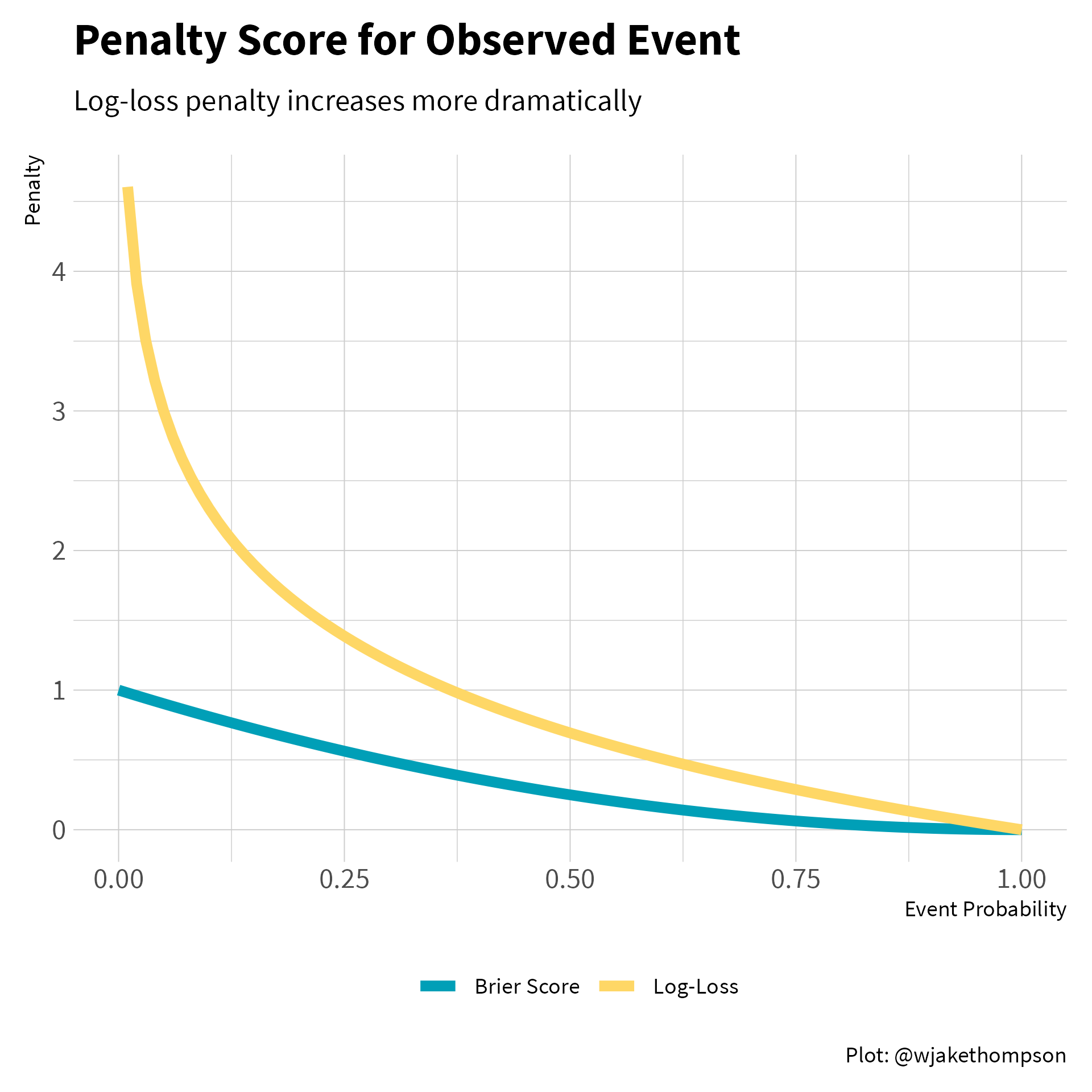
Unlike, the log-loss, the penalty for the Brier score is almost linear. Below we can see that the log-loss penalty increases exponentially for observed events with a low probability, whereas the Brier penalty increases much more slowly. Therefore, the Brier Score is more forgiving of a forecast that estimated low probabilities for events that ended up happening.
Code to reproduce
tibble(prob = seq(0, 1, by = 0.01)) %>%
  mutate(log_loss = -1 * log(prob),
         brier = (prob - 1) ^ 2,
         log_loss = case_when(is.infinite(log_loss) ~ NA_real_,
                              TRUE ~ log_loss)) %>%
  pivot_longer(cols = c(log_loss, brier), names_to = "measure",
               values_to = "penalty") %>%
  ggplot(aes(x = prob, y = penalty)) +
  geom_line(aes(color = measure), na.rm = TRUE, size = 2) +
  scale_color_wjake(labels = c("Brier Score", "Log-Loss")) +
  labs(x = "Event Probability", y = "Penalty", color = NULL,
       title = "Penalty Score for Observed Event",
       subtitle = "Log-loss penalty increases more dramatically",
       caption = "Plot: @wjakethompson") +
  theme(plot.caption = element_text(face = "plain")) -> p

ggsave2(p, knitr::fig_path(".png"), width = 6, height = 6)
A perfect prediction (e.g., a probability of 1.0 and the event actually occurring) would result in a Brier score of 0, as yi and ŷi are the same. Conversely, is 1 when the probability of an event is 1.0 and the even doesn’t occur, or the reverse where the probability is 0.0 and the event does occur. As with the log-loss, we take the average of all the error terms to get the overall Brier score.
The final measure is a weighted Brier score. The idea here is that not all predictions are created equal. In the United States’ election system, states have different numbers of electoral votes. Therefore, we should weight our predictions based on their influence on the overall outcome. For example, suppose a forecast gave Donald Trump a 70% chance of winning both Vermont and California (purposefully choosing outrageous examples). In reality, Trump won neither. Should an equal penalty be applied for each state? Vermont has only 3 electoral votes, whereas California has 55, more than any other state. Therefore, getting California wrong has a much larger impact on determining the winner of the presidential race. To account for this, we can weight the Brier score by the number of electoral votes for each state.
\[ \text{Weighted Brier Score} = \frac{1}{\sum_{i=1}^PEV_i}\sum_{i = 1}^PEV_i(\hat{y}_i - y_i)^2 \]
Here, EVi is the number of electoral votes for the given prediction. Thus, instead of taking a pure average of the squared errors, we are taking a weighted average. We multiply each squared error by the number of electoral votes associated with the prediction, and then divide to sum of the weighted errors by the total weight, or the total number of electoral college votes.
Using this formulas, we can calculate the prediction accuracy measures for each forecast. These results are summarized in the table below.
Code to reproduce
library(tidyverse)
library(here)
library(fs)

results_2020 <-
  here("content", "blog", "2021-11-07-2020-election-forecasts",
       "data", "results.csv") %>%
  read_csv(col_types = cols())

ev_2020 <-
  here("content", "blog", "2021-11-07-2020-election-forecasts",
       "data", "electoral-votes.csv") %>%
  read_csv(col_types = cols())

raw_data <-
  dir_ls(here("content", "blog", "2021-11-07-2020-election-forecasts",
            "data", "forecasts")) %>%
  map_dfr(read_csv, col_types = cols()) %>%
  full_join(ev_2020, by = c("state_name", "state_abbr")) %>%
  full_join(results_2020, by = c("state_name", "state_abbr"))

pred_acc_results <- raw_data %>%
  mutate(biden = case_when(biden == 0 ~ 0.00001,
                           biden == 1 ~ 0.99999,
                           TRUE ~ biden)) %>%
  group_by(model) %>%
  summarize(log_loss = (-1 / n()) *
              sum((biden_win * log(biden)) + (1 - biden_win) * log(1 - biden)),
            brier = (1 / n()) * sum((biden - biden_win) ^ 2),
            w_brier = (1 / sum(ec_votes)) * sum(ec_votes * ((biden - biden_win) ^ 2)),
            .groups = "drop")

pred_acc_results
#> # A tibble: 16 × 4
#>    model                   log_loss  brier w_brier
#>    <chr>                      <dbl>  <dbl>   <dbl>
#>  1 2016 Map                   1.23  0.107   0.138
#>  2 Decision Desk HQ           0.160 0.0456  0.0701
#>  3 Drord Mapmaking            0.137 0.0461  0.0789
#>  4 Economist                  0.385 0.0692  0.0739
#>  5 Electoral Polls            0.116 0.0390  0.0600
#>  6 FiveThirtyEight            0.137 0.0400  0.0663
#>  7 JHK                        0.118 0.0394  0.0661
#>  8 Lean Tossup                0.170 0.0606  0.117
#>  9 New Statesman              0.236 0.0679  0.0724
#> 10 Plural Vote                0.133 0.0417  0.0616
#> 11 PredictIt                  0.158 0.0385  0.0549
#> 12 Princeton                  0.123 0.0407  0.0636
#> 13 Progress Campaign          0.149 0.0449  0.0727
#> 14 Race to the White House    0.132 0.0456  0.0785
#> 15 Reed                       0.189 0.0555  0.0731
#> 16 The Cycle 0.134 0.0410 0.0816library(gt)
pred_acc_results %>%
mutate(log_loss_rank = rank(log_loss),
brier_rank = rank(brier),
w_brier_rank = rank(w_brier),
avg_rank = (log_loss_rank + brier_rank + w_brier_rank) / 3,
across(c(log_loss, brier, w_brier), ratlas::fmt_digits, digits = 3),
across(c(log_loss, brier, w_brier), as.factor),
log_loss = fct_reorder(log_loss, log_loss_rank),
brier = fct_reorder(brier, brier_rank),
w_brier = fct_reorder(w_brier, w_brier_rank)) %>%
arrange(avg_rank) %>%
select(-avg_rank) %>%
mutate(across(ends_with("_rank"), ~case_when(.x < 10 ~ paste0(" ", .x),
TRUE ~ paste0(.x)))) %>%
gt() %>%
gt_theme_wjake() %>%
tab_options(table.align = "center") %>%
cols_label(model = "Forecast", log_loss = "Log Loss", brier = "Brier Score",
w_brier = "Weighted Brier") %>%
tab_header(
title = md("**Prediction Accuracy for 2020 Election Forecasts**")
) %>%
tab_source_note(source_note = "TABLE: @WJAKETHOMPSON") %>%
cols_merge(columns = c(log_loss, log_loss_rank),
pattern = "{1} <sup>{2}</sup>") %>%
cols_merge(columns = c(brier, brier_rank),
pattern = "{1} <sup>{2}</sup>") %>%
cols_merge(columns = c(w_brier, w_brier_rank),
pattern = "{1} <sup>{2}</sup>") %>%
tab_style(style = cell_text(font = "Source Code Pro"),
locations = cells_body(
columns = c(log_loss, brier, w_brier)
)) %>%
tab_style(style = cell_borders(sides = "bottom",
color = "black",
weight = px(1)),
locations = cells_body(columns = everything(),
rows = 16)) %>%
cols_width(c(model) ~ px(200),
c(log_loss, brier, w_brier) ~ px(100)) %>%
data_color(
columns = c(log_loss, brier, w_brier),
colors = scales::col_factor(
palette = ramp_blue(seq(0.1, 0.9, length.out = 16)),
domain = NULL
)
) -> gt_pred_acc| Prediction Accuracy for 2020 Election Forecasts | |||
|---|---|---|---|
| Forecast | Log Loss | Brier Score | Weighted Brier |
| Electoral Polls | 0.116 1 | 0.039 2 | 0.060 2 |
| JHK | 0.118 2 | 0.039 3 | 0.066 5 |
| PredictIt | 0.158 10 | 0.038 1 | 0.055 1 |
| Princeton | 0.123 3 | 0.041 5 | 0.064 4 |
| Plural Vote | 0.133 5 | 0.042 7 | 0.062 3 |
| FiveThirtyEight | 0.137 8 | 0.040 4 | 0.066 6 |
| Race to the White House | 0.132 4 | 0.046 9 | 0.078 12 |
| Progress Campaign | 0.149 9 | 0.045 8 | 0.073 9 |
| The Cycle | 0.134 6 | 0.041 6 | 0.082 14 |
| Decision Desk HQ | 0.160 11 | 0.046 10 | 0.070 7 |
| Drord Mapmaking | 0.137 7 | 0.046 11 | 0.079 13 |
| Reed | 0.189 13 | 0.055 12 | 0.073 10 |
| New Statesman | 0.236 14 | 0.068 14 | 0.072 8 |
| Lean Tossup | 0.170 12 | 0.061 13 | 0.117 15 |
| Economist | 0.385 15 | 0.069 15 | 0.074 11 |
| 2016 Map | 1.234 16 | 0.107 16 | 0.138 16 |
| TABLE: @WJAKETHOMPSON | |||
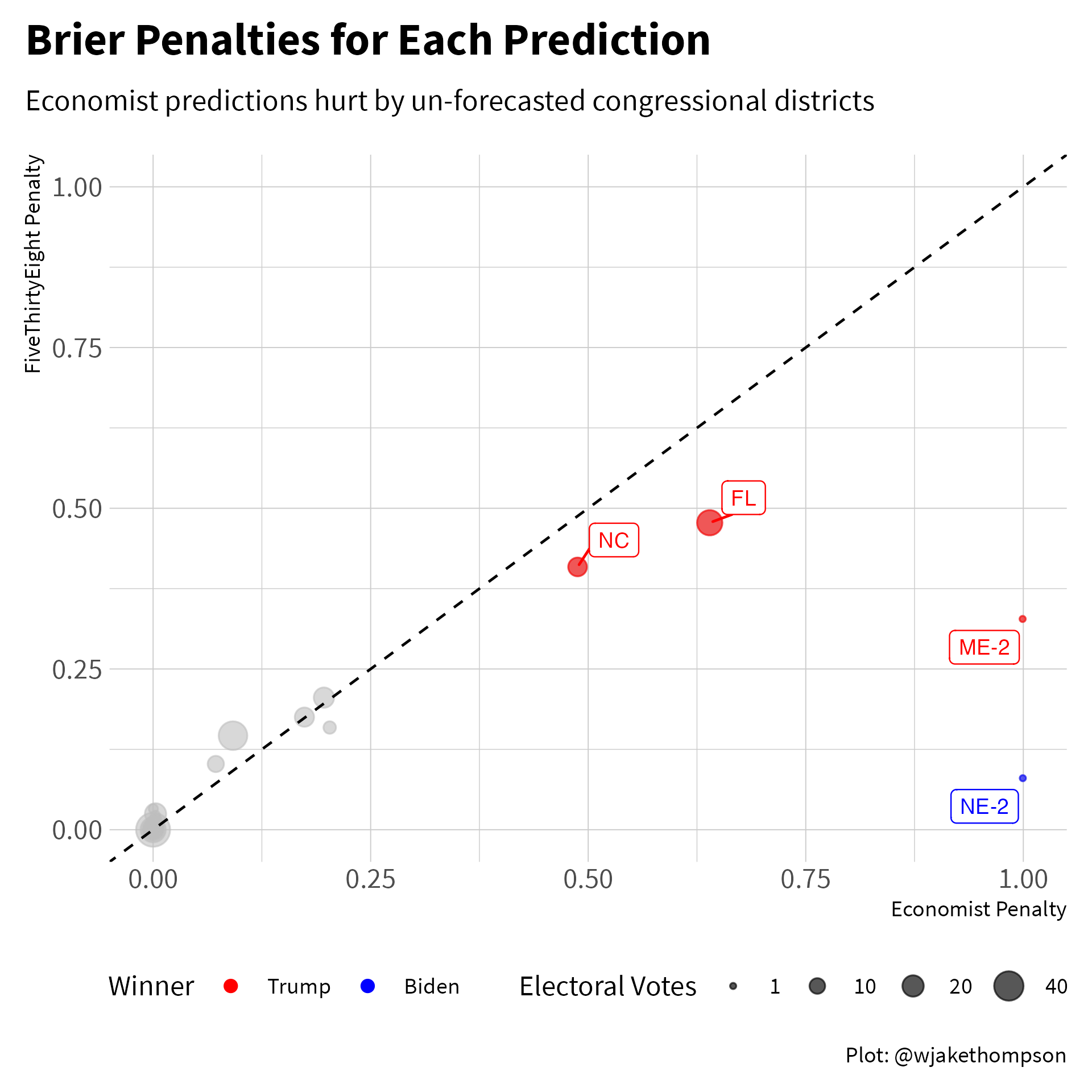
Overall, the Electoral Polls forecast had the best accuracy. The biggest surprise to me was that the Economist forecast came in last, only beating the baseline 2016 map. What what gives? Let’s compare the Economist forecast to the FiveThirtyEight forecast, which came in close the the middle of the road. The two biggest misses for the Economist were the congressional districts from Nebraska and Maine that went in the opposite direction of the overall state. Maybe this isn’t fair since the Economist didn’t actually forecast the individual congressional districts, but on the other hand, the statewide forecast from the Economist included all of the electoral votes from that state, including the congressional district votes. The other two largest penalties came from North Carolina and Florida. In North Carolina, the Economist forecast gave Trump a 30% chance of winning, compared to 36% in the FiveThirtyEight model. Similarly in Florida, the Economist model gave Trump only a 20% chance of winning, compared to 31% in the FiveThirtyEight model. Trump ended up winning both states, so there were smaller penalties for FiveThirtyEight since that model gave Trump a greater chance of winning.
Code to reproduce
library(gghighlight)
library(ggrepel)

raw_data %>%
  filter(model %in% c("Economist", "FiveThirtyEight")) %>%
  mutate(biden = case_when(biden == 0 ~ 0.00001,
                           biden == 1 ~ 0.99999,
                           TRUE ~ biden)) %>%
  group_by(model) %>%
  mutate(log_loss_penalty = -1 *
           ((biden_win * log(biden)) + ((1 - biden_win) * log(1 - biden))),
         brier_penalty = (biden - biden_win) ^ 2) %>%
  pivot_wider(names_from = model,
              values_from = c(trump, biden, log_loss_penalty, brier_penalty)) %>%
  ggplot(aes(x = brier_penalty_Economist, y = brier_penalty_FiveThirtyEight)) +
  geom_point(aes(size = ec_votes, color = factor(biden_win)), alpha = 0.6) +
  gghighlight(brier_penalty_Economist > 0.25, label_key = state_abbr,
              label_params = list(size = 3), use_group_by = FALSE,
              use_direct_label = FALSE) +
  geom_label_repel(aes(label = state_abbr, color = factor(biden_win)),
                   size = 3, show.legend = FALSE) +
  scale_color_manual(values = c("red", "blue"),
                     labels = c("Trump", "Biden"),
                     name = "Winner") +
  scale_size_area(name = "Electoral Votes",
                  limits = c(1, 55),
                  breaks = c(1, 10, 20, 40)) +
  geom_abline(slope = 1, intercept = 0, linetype = "dashed") +
  expand_limits(x = c(0, 1), y = c(0, 1)) +
  labs(x = "Economist Penalty", y = "FiveThirtyEight Penalty",
       title = "Brier Penalties for Each Prediction",
       subtitle = "Economist predictions hurt by un-forecasted congressional districts",
       caption = "Plot: @wjakethompson") +
  guides(color = guide_legend(override.aes = list(alpha = 1, size = 2),
                              order = 1),
         size = guide_legend(order = 2)) +
  theme(plot.caption = element_text(face = "plain"),
        plot.title.position = "plot",
        legend.box = "horizontal") -> p

ggsave2(p, knitr::fig_path(".png"), width = 6, height = 6)
Model Accuracy
For an evaluation of model accuracy, we assume that the estimated probabilities from each forecast are true. Using these probabilities, we then simulate the election hundreds or thousands of times. From each simulation, we can then calculate the number of electoral votes won by each candidate. Across all simulations, we can then compare the distributions of the expected electoral college votes to the observed outcome.
Simulation code
# Observed results -------------------------------------------------------------
real_election <- raw_data %>%
  filter(model != "2016 Map") %>%
  mutate(biden_pick = case_when(biden >= 0.5 ~ 1L,
                                TRUE ~ 0L)) %>%
  group_by(model) %>%
  summarize(biden_ec = sum(ec_votes * biden_win),
            incorrect_picks = sum(biden_pick != biden_win))

# Calculate correlations between states/CDs ------------------------------------
library(politicaldata)

states <- distinct(raw_data, state_name, state_abbr)

historical_results <- read_csv(here("content", "blog",
                                    "2016-11-08-election-forecast-performance",
                                    "data", "election_dem_history.csv"),
                               col_types = cols()) %>%
  arrange(Year) %>%
  filter(Year < 1976) %>%
  rename(`District of Columbia` = `Washington DC`)

new_states <- pres_results %>%
  as_tibble() %>%
  distinct(state_abbr = state, Year = year, dem) %>%
  left_join(states, by = "state_abbr") %>%
  select(-state_abbr) %>%
  pivot_wider(names_from = state_name, values_from = dem)

new_cd <- pres_results_by_cd %>%
  as_tibble() %>%
  filter(state_abb %in% c("ME", "NE")) %>%
  mutate(state_abbr = paste0(state_abb, "-", district)) %>%
  distinct(Year = year, state_abbr, dem) %>%
  pivot_wider(names_from = state_abbr, values_from = dem,
              values_fn = mean)

new_results <- full_join(new_states, new_cd, by = "Year")

state_order <- sort(states$state_name)

dem_history <- bind_rows(historical_results, new_results) %>%
  select(Year, !!!state_order)

rho <- cov(select(dem_history, -Year), use = "complete.obs")

# Simulation elections ---------------------------------------------------------
library(mvtnorm)
set.seed(306)

sim_election <- raw_data %>%
  arrange(model, state_name) %>%
  nest(forecast = -model) %>%
  mutate(
    sim_elections = map(forecast,
                        function(f, mat) {
                          f <- f %>%
                            mutate(var = biden * (1 - biden))
                          cur_prob <- pull(f, biden)
                          cur_var <- pull(f, var)
                          diag(mat) <- cur_var
                          sim <- rmvnorm(n = 1000, mean = cur_prob,
                                         sigma = mat)
                          colnames(sim) <- f$state_name
                          sim %>%
                            as_tibble() %>%
                            rowid_to_column(var = "sim") %>%
                            pivot_longer(cols = -sim, names_to = "state_name",
                                         values_to = "sim_val") %>%
                            mutate(biden_win = case_when(sim_val >= 0.5 ~ 1L,
                                                         TRUE ~ 0L)) %>%
                            select(-sim_val)
                        },
                        mat = rho),
    sim_summary = map2(forecast, sim_elections,
                       function(f, s) {
                         sim_info <- s %>%
                           rename(biden_sim = biden_win) %>%
                           left_join(select(f, state_name, ec_votes, biden_win),
                                     by = "state_name")

                         sim_info %>%
                           group_by(sim) %>%
                           mutate(won_vote = biden_sim * ec_votes,
                                  incorrect = biden_sim != biden_win) %>%
                           summarize(biden_ec = sum(won_vote),
                                     incorrect_picks = sum(incorrect),
                                     .groups = "drop")
                       }),
    ppp = map2(model, sim_summary,
              function(m, s, real) {
                obs_ec <- real %>%
                  filter(model == m) %>%
                  pull(biden_ec)
                obs_incorrect <- real %>%
                  filter(model == m) %>%
                  pull(incorrect_picks)

                tibble(ec_ppp = mean(s$biden_ec > obs_ec),
                       ip_ppp = mean(s$incorrect_picks > obs_incorrect))
              },
              real = real_election))
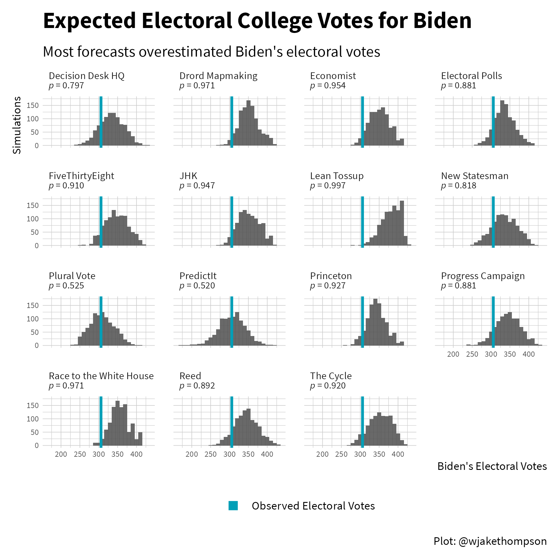
In the figure below, the histograms show the expected number of electoral votes for Biden under each model, with the blue line representing the 306 he actually received. One way to assess the model accuracy is to evaluate the proportion of simulations where the number of electoral votes received by Biden is greater than the observed electoral votes. Numbers very close to 0 or 1 indicate poor fit (i.e., the observed number is well outside the expected distribution).
Code to reproduce
library(ggtext)

sim_election %>%
  filter(model != "2016 Map") %>%
  select(model, sim_summary, ppp) %>%
  unnest(ppp) %>%
  mutate(label = glue::glue("{model}<br><span style = 'font-size:7.5pt'>*p* = {ratlas::fmt_digits(ec_ppp, 3)}</span>")) %>%
  select(label, sim_summary) %>%
  unnest(sim_summary) %>%
  ggplot(aes(x = biden_ec)) +
  facet_wrap(~label, ncol = 4) +
  geom_histogram(binwidth = 10, alpha = 0.9) +
  geom_vline(data = real_election,
             aes(xintercept = biden_ec),
             color = palette_wjake[1], linetype = "solid", size = 1) +
  geom_point(aes(x = 300, y = 0, color = "Observed Electoral Votes"),
             alpha = 0) +
  labs(x = "Biden's Electoral Votes", y = "Simulations", color = NULL,
       title = "Expected Electoral College Votes for Biden",
       subtitle = "Most forecasts overestimated Biden's electoral votes",
       caption = "Plot: @wjakethompson") +
  theme(strip.text = element_markdown(size = rel(0.7)),
        plot.caption = element_text(face = "plain"),
        plot.subtitle = element_text(margin = margin(0, 0, 5, 0)),
        axis.text.x = element_text(size = rel(0.7)),
        axis.text.y = element_text(size = rel(0.7)),
        panel.spacing.y = unit(1, "lines"),
        panel.spacing.x = unit(1, "lines")) +
  guides(color = guide_legend(override.aes = list(shape = 15, size = 3,
                                                  alpha = 1))) -> p

ggsave2(p, knitr::fig_path(".png"), width = 6, height = 6)
Most models over estimated the number of electoral votes Biden would receive, with the bulk of the distribution shifted to the right of the blue line. Only the forecasts from Plural Vote and PredictIt got had an expected distribution close to centered on the observed outcome. However, the observed 306 was within the middle 80% of the Electoral Polls, New Statesman, Progress Campaign, and Reed forecasts as well, indicating that those models also did an okay job.
Final Thoughts
Taken all together, the Electoral Polls forecast and the market derived probabilities from PredictIt showed the best performance for both prediction and model accuracy. I’m still unsure how useful these forecasts are in practice, but I don’t think they’re going anywhere anytime soon. And with the mid-term elections coming up in in 2022, it’s good to be thinking about how accurate different forecasts might be!
Acknowledgments
Featured photo by Element5 Digital on Unsplash.