
Earlier this week Mike Bostock tweeted a interesting looking contour plot with a link to edit the formula and manipulate the graphic using D3.js.
I decided I would attempt to recreate the image using ggplot2, and animate it using the new gganimate package.
Creating the data
I started by creating a data frame with all the combinations of x and y on a grid between -10 and 10, in intervals of 0.1. Then I defined a third variable, z as a function of x and y, using the same equation as originally used here.
plot_data <- crossing(x = seq(-10, 10, 0.1), y = seq(-10, 10, 0.1)) %>%
  mutate(z = sin(sin(x * (sin(y) - cos(x)))) - cos(cos(y * (cos(x) - sin(y)))))

plot_data
#> # A tibble: 40,401 × 3
#>        x     y       z
#>    <dbl> <dbl>   <dbl>
#>  1   -10 -10   -1.77
#>  2   -10  -9.9 -0.950
#>  3   -10  -9.8 -0.275
#>  4   -10  -9.7 -0.138
#>  5   -10  -9.6  0.0279
#>  6   -10  -9.5 -1.01
#>  7   -10  -9.4 -1.80
#>  8   -10  -9.3 -1.28
#>  9   -10  -9.2 -0.564
#> 10   -10  -9.1 -0.227
#> # … with 40,391 more rows
Now we can use that data to make the image!
Create the plot
To create the plot, we are basically making a heat map of sorts, where the fill is defined by the newly calculated z variable. I use geom_raster because it offers speed improvements over geom_tile when all tiles are the szme size, which they are in this case. Given that we have a lot of tiles, I’ll take the speed!
ggplot(plot_data, aes(x = x, y = y)) +
  geom_raster(aes(fill = z), interpolate = TRUE, show.legend = FALSE) +
  scale_fill_viridis_c(option = "C") +
  coord_equal() +
  theme_void()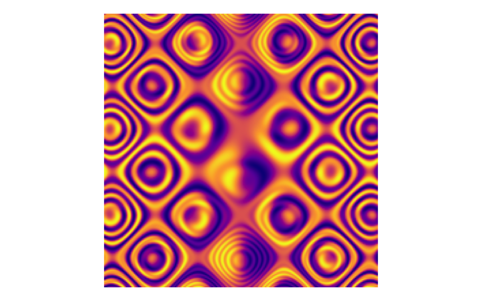
Pretty good! But then, Jeff Baumes upped the stakes!
Well now I can’t not animate it. So…
Add time and animate
To create an animated plot, we need a time variable, t. We start by creating a data frame similar to the one we created above. It includes all combinations of x and y from -10 to 10 in increments of 0.1, but now those values are also cross with the time variable, t, which goes from 0 to 5 in increments of 0.1. The z variable, which will still be our fill color, is now a function of x, y, and t, as in Jeff’s example. Finally, we can use the same ggplot2 code as above, with the addition of the transition_time function from gganimate.
t_lookup = data_frame(t = c(seq(0, 5, 0.1), seq(4.9, 0, -0.1)),
                      t2 = seq(0, 10, 0.1))

plot_data <- crossing(x = seq(-10, 10, 0.1), y = seq(-10, 10, 0.1),
                      t2 = seq(0, 10, 0.1)) %>%
  left_join(t_lookup, by = "t2") %>%
  mutate(z = sin(sin(x * (sin(y + t) - cos(x - t)))) - cos(cos(y * (cos(x - t) - sin(y + t)))))

ggplot(plot_data, aes(x = x, y = y)) +
  geom_raster(aes(fill = z), interpolate = TRUE, show.legend = FALSE) +
  scale_fill_viridis_c(option = "C") +
  coord_equal() +
  theme_void() +
  transition_time(t2)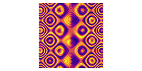
And there we have it! With just one extra variable and one additional line of code for our plot, we have an animated contour plot!
Acknowledgments
Featured photo by Dan Meyers on Unsplash.